Most people I know who analyze data or build models and then present the results do the first part in Excel, but switch over to PowerPoint or something else to make the ‘client-ready’ output. A few years back, I switched to making the majority of my presentations directly in Excel.
This is a topic I’m very interested in, and I’m sure I’ll write more about it later (especially re: pros and cons of making your slides in Excel vs PPT), but for now I just want to share a few examples to give you a flavor of what’s possible in Excel.
These are all entries I prepared for Microsoft’s Excel World Championship, which ran over the last few months (with the finals to follow in the New Year). For each one, we were asked to create a visualization from a specific set of publicly available data about the Olympic Games. You can also see all the other entries for the first 3 rounds through the link above. There’s some really good stuff there, and it’s also very interesting to see the different ways that a big group of people charted the same data.
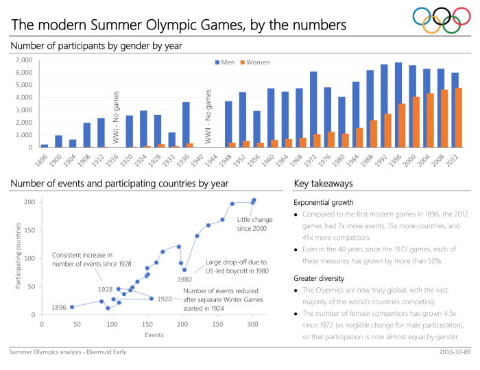
Round 1: visualizing data about the growth (in athletes, events, and countries) of the modern Games, as well as increasing gender diversification.

Round 2: visualizing data about the main revenue sources for the Games, and what has driven their growth.
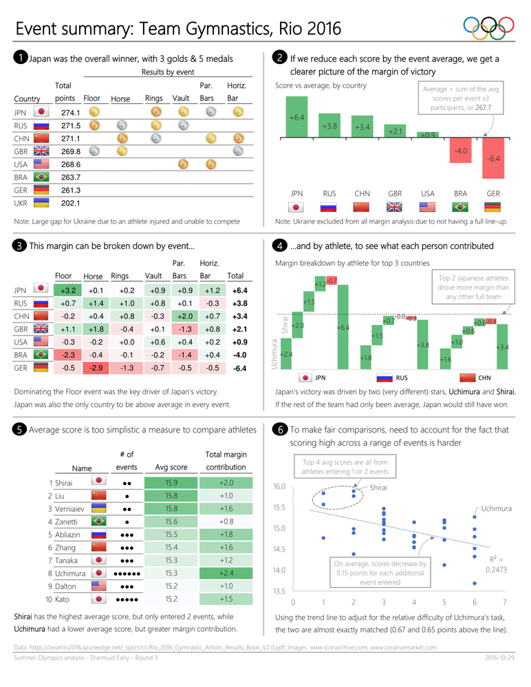
Round 3: visualizing the results from the men’s team gymnastics event in Rio 2016.

Round 4: visualizing the changes in medalist performance over time for the women’s 100m freestyle event.

One thing is abundantly clear from that link above, very few people know how to present data -even just one graph- in a clear and easy to understand format.
Some fall for the “One graph for all” trap and try to squeeze everything they need to say into one graph with 3+ axis that just leads to a cluttered mess.
Others go for graphs that do not clearly show what they are trying to illustrate, for example using a population pyramid to show far more clearly in your first graph.
Then again I’m not one to talk, I probably couldn’t make half of those graphs… 😛
LikeLike