Part of the art of making a great data visualization is finding the right way to show a certain data set. If you work in Excel a lot, you might be used to ‘finding the right way’ meaning ‘choosing between a bar chart, line chart, and pie chart’ – but sometimes the data calls for a very different visualization, and in this post I’m going to share an example of that.
The data set I was trying to visualize was this:
1. e4 e5 2. f4 exf4 3. Bc4 Qh4+ 4. Kf1 b5?! 5. Bxb5 Nf6 6. Nf3 Qh6 7. d3 Nh5 8. Nh4 Qg5 9. Nf5 c6 10. g4? Nf6 11. Rg1! cxb5? 12. h4! Qg6 13. h5 Qg5 14. Qf3 Ng8 15. Bxf4 Qf6 16. Nc3 Bc5 17. Nd5 Qxb2 18. Bd6! Bxg1? 19. e5! Qxa1+ 20. Ke2 Na6 21. Nxg7+ Kd8 22. Qf6+! Nxf6 23. Be7# 1–0
If you know a little about chess, you might recognize that this is ‘algebraic notation’ for a chess game. If you know a lot, you might recognize it as ‘The Immortal Game’, one of the most famous chess games of all time. Adolf Anderssen, playing white, sacrificed most of his strongest pieces, including both rooks and the queen, but was still able to make checkmate with two knights and a bishop.
I stumbled across the article on the Immortal Game during a long random walk through Wikipedia one evening (I gather I’m not alone in this), and wanted to understand how the game had unfolded. Unfortunately, I don’t know much about chess, and wasn’t able to follow along from the technical notation and the few illustrations. There was also a gif animation of the whole game, but since you can’t pause or jump to a specific point, I didn’t find that helpful either.
After having a similar experience trying to follow a couple of other games in the same way, I decided to take matters into my own hands, and make an Excel file to take chess games in standard notation, and turn them into a visualization. (If that seems like a very odd thought process, there’s probably nothing I can write here that will make it more relatable!)
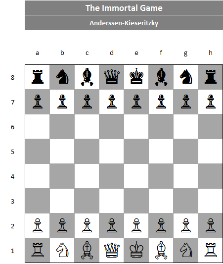
Here’s what I came up with:


‘Traditional’ Excel visualization of the Immortal Game.
OK, just kidding… that’s what you might think of as a more ‘traditional’ Excel visualization – and while it does show interesting information (e.g. that White expanded its position much more, but at the cost of losing many of its nobles, while Black was more conservative on position but held all its nobles until the end), it doesn’t help to understand the details of what happens in the game. Here’s what I actually did:
Animation of the Immortal Game (gif created with GIFCreator.me, images created in Excel)
I’ve converted it to a gif so you can see it run, but in the spreadsheet (which you can download below) there’s a slider which you can use to move back and forth to specific points, or to scroll through the game. It also has a dropdown at the top to allow you to pick from different games. It comes pre-loaded with the Immortal Game, the Game of the Century (an iconic win for a young Bobby Fischer), and the 27 games from the last two World Chess Championships, and it can easily handle the addition of more games.
Here’s the link to download the workbook (note that no macros were harmed in the making of this workbook – it’s all VBA-free, so safe to download):
Chess animator-2017-08-06 (published)
The one caveat is that, because of the way it’s structured (more nerdy details below if you’re interested), it can’t handle pawn promotion, so it’s not able to complete one of the games it comes with, which features a promotion (it also can’t handle some of the more complicated disambiguations that can occur after a promotion, e.g. if you have 3 different queens all of which could take a particular square). Luckily, promotion is quite rare in high-level chess, so hopefully that’s not too big a deal…
How it works
The basic structure of the workbook is like this:
- The tab Games contains all the stored games, with each pair of moves (black / white) on a separate line.
- The tab Moves takes the moves for the active game and parses them to extract the type of piece moving, where it’s moving to, and any disambiguation info.
- The tab Positions has a row for each of the 32 starting pieces, and a series of columns for each move with the (x,y) co-ordinates of that piece on that move (if still in play).
- The tab Board has the output, and the formula for each square figures out the value of the piece (if any) on the square based on a given move number, and converts it to an ASCII chess character with a lookup. A slider makes it easy to quickly pick the move number, or to scroll through the game one move at a time.
Obviously ‘Positions’ is where the magic happens, so let’s take a closer look at that. There are 4 columns for each move after the first: one that flags if the piece in that row is the one that makes the current move; one that flags if the piece in that row is taken in the current move; and one that has the (x,y) coordinates of each position after the move.
The real challenge, then, is to figure out for any given move if a given piece could have made that move. This requires different logic for each piece*, some of which are quite complicated. The ‘simple’ pawn might be the most complex, since the formula has to allow for:
- Different moves depending on whether a piece is being taken or not (diagonal when taking, straight when just moving);
- Extra complications to handle the en passant rule (where a pawn can be taken by another pawn moving onto a square it isn’t on);
- Disambiguation for the case where one pawn ends up in front of a second that is still in its starting position (if you assume that a pawn in its starting position can always move 2 squares forward, you can end up thinking two pawns could each be making the move; the pawn at the back can’t make the move legally, so there won’t be any disambiguation in the notation in this case, so you have to check if the next space is occupied).
The cells on the Positions tab are color-coded to indicate ones that have the same or different formulas, with comments on the approach for each type, so feel free to go and explore…
Adding more games
If you want to add more games, you can just insert new columns on the Games tab in the same format as the existing ones. If you have your whole game in one string, rather than one row per move as on that tab, you can paste it into cell A1 of the Splitter tab, which will split it into individual moves. Note that it starts by removing the string “(diagram)”, since most of the games I sourced from Wikipedia marked the point in the game that the diagram illustrated that way – if you have other annotations, you’ll have to get rid of them first.
*If the structure held the co-ordinates fixed and figured out what piece was in each square on any given turn (rather than holding the pieces fixed and figuring out their co-ordinates on each turn) then it would be possible to handle pawn promotion in a way that my setup can’t. The trade-off is that the formula for figuring out if a given piece could have moved to a given space becomes way more complicated if it needs to cover a case for every different piece, compared to the structure used where any given row will only ever contain one piece.

Great ideas and efforts even i am not a fan of chess but fan of excel visualization.
wish to see more regard card games!
LikeLiked by 1 person
Amazing Excel file Diarmuid! I love Excel and Chess! I will be reviewing all of these games for sure. Cheers, Kevin.
LikeLike
Brilliant! I added a game, but it doesn’t show in the pop-up in Board!c1. I tried using design mode, but couldn’t see where the pop-up was getting it’s data from (even though it’s obviously Games!a1 – ac1.
LikeLike
Hmmm, yes I probably should have made that expand automatically… the drop-down picks from the named range ‘GameList’, which in the original file refers to the same range you mentioned. You can either edit the named range to pick up additional columns (Ctrl + F3 brings up the name editor) or insert a column somewhere in the middle of the range to add your new game and it will automatically be included.
One way to get around this in real life is to include an empty column at the end of the input range (included in the named range) with a note to users to insert additional columns before that one… but I didn’t do that!
LikeLike
Hi.
Got it, thanks. I expanded GameList, Board!c2 and Moves!a3..a152, and then it all worked; so yeah, inserting a column in Games will work.
LikeLike