This is part 2 of my analysis of US Senate voting data. You can find part 1 here.
In part 1, we looked at each senator’s degree of alignment to their party, and how this changed over time. This time, I want to dive a little deeper into comparing senators to each other, separately from their party allegiance.
There are a few reasons that the simple party alignment measure we looked at before isn’t good for this. The first is that senators might disagree with their party in different areas – Senator A might vote Republican except on social policy, while Senator B might vote Republican except on economic issues, and the two would look similarly aligned to their party (depending on the mix of vote topics), but actually disagree with each other on most topics. The second is that, to keep the measure symmetrical between Republicans and Democrats, we removed all votes where both parties agreed – but a senator who regularly votes against the majority of both parties is very different to one who rarely does, even if they have similar numbers on partisan votes.
A good example of this is to contrast Senator Ted Cruz (R, TX) and Senator Susan Collins (R, ME). Looking only at votes where (the majority of) the two parties disagreed, Cruz aligned with his party 90% of the time, and Collins only 67% of the time. But on the votes where the parties agreed, Collins voted against both on only 2 out of 103 votes, while Cruz voted against both on 28 out of 63 [1], so that their overall party alignment is much closer together (81% for Cruz and 74% for Collins).
So, to get away from the narrow partisan lens, let’s look at a simple metric for any pair of senators: of the measures they both voted on, on what proportion did they vote the same way? This allows us to compare the level of alignment for any two senators.
A few immediate questions this measure suggests (all for the 2015 data):
- Which two senators disagreed the most? Senator Elizabeth Warren (D, MA) and Senator David Vitter (R, LA), who disagreed on 230 out of 282 votes, or 82% of the time.
- Which two senators disagreed the least? Senators Maria Cantwell and Patty Murray (both D, WA) agreed on 332 out of 334 votes, or 99.4% of the time.
- Which two senators in the same party disagreed the most? That would be the aforementioned Senators Cruz and Collins, who agreed on 143 out of 259 votes, or just 55% of the time. For the Democrats, it’s Senator Joe Manchin (D, WV) and Senator Ron Wyden (D, OR), who agreed on 221 out of 331 votes, or just 67% of the time.
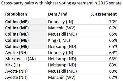
- Which two senators from differing parties agreed the most? Senator Collins again, this time with Senator Joe Donnelly (D, IL) – they agreed on 236 out of 336 votes, or 70% of the time. In fact, all of the top 5 cross-party collaborations feature Senator Collins:
One other fun thing: based on this measure, every senator has another who is the most likely to vote against them (who I’ll call their nemesis, just to keep it dramatic). The most prolific nemesis is Senator Bernie Sanders (I, VT), who was the person most likely to vote against 27 of the 54 senate Republicans in 2015. Another 17 were most likely to be voted against by Elizabeth Warren (as you might expect, Senators Sanders and Warren are mostly on the same page – they voted together 95% of the time in 2015). The Democrats’ nemeses are even more concentrated, with just 3 covering all of them: Senators Vitter (nemesis to 20 out of 46 Democrats), Rubio (15) and Cruz (11).
I was hoping to find someone whose nemesis was in their own party but, perhaps unsurprisingly given the increasing separation of the parties, that never happened in 2015. If I go back to the older 1989 data, though, there are examples of nemeses within both parties. Senator Howell Heflin (D, AL), who actually voted more like a Republican than a Democrat anyway, had Democratic Senator Ted Kennedy (D, MA) as his nemesis, and a whopping 9 moderate Republicans (along with 25 Democrats) were most likely to be voted against by Senator Jesse Helms (R, NC).
I called this series of posts ‘mapping divisions in the US Senate’, and ultimately that was what I was trying to find a way to do – to create a visualization to show the degree of alignment or disagreement, and who the outliers on both sides were [2].
Without getting too much into the technical details, there’s a powerful statistical technique called multidimensional scaling (or MDS), which finds the 2-D (usually) set of points with pairwise distances that are as close as possible to a set of pairwise distances given as an input. In this case, the input is a 100 x 100 matrix with the % disagreement between every pair of senators, and the output is a ‘map’, on which the distance between any pair is as close as possible to the % of the time they disagree on votes [3].
Here’s what the outcome looks like for 2015 [4]. I’ve labeled some of the ‘outliers’ and the two party leaders.
Multidimensional scaling of US Senate, 2015

The most striking thing about this chart, of course, is just how divided it is. (I originally thought about setting this as an Excel challenge: given anonymized voting data from an unspecified senate session, try to identify the two parties. With this technique, 2015 would be a cakewalk.) It’s also interesting to see that, aside from a few outliers, the Democrats are clustered much more closely together (perhaps in part as a function of being in the minority?).
The other striking thing is to look at the positions of the senators who ran for President. If the senate is more polarized than the country as a whole, then the group of senators who chose to run for President this year is significantly more polarized again. In fact, Bernie Sanders is the furthest to the left in the chart above, and Marco Rubio and Ted Cruz are the first and third respectively from the right.
Briefly, take a look at how this compares to the older data from 1989:
Multidimensional scaling of US Senate, 1989

Consistent with what we found last time, the partisan divisions were much less pronounced in 1989 (although a party divide is still clearly visible), and a much larger portion of the variation occurs on the non-partisan y-axis. No two senators disagreed more than 60% of the time (compared to a range up to 82% in 2015).
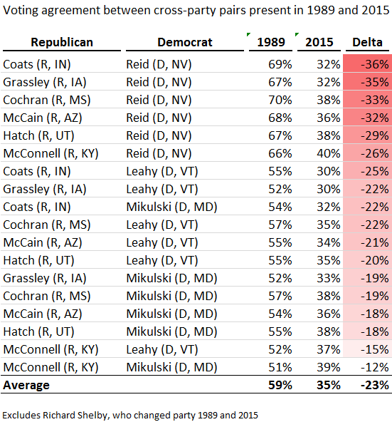
One final observation: if you think that the greater division more recently is because we’ve started electing much more combative people to the Senate lately, think again. I looked at the senators in the senate in 1989 and 2015, and how often each cross-party pair agreed with each other in each of the two sessions (I excluded Richard Shelby, who changed parties between the two sessions). The differences were striking: in 1989, every pair agreed with each other on a majority of votes, averaging 59% agreement. In 2015, the level of agreement averaged 35%, with no pair above 40%. Harry Reid seems to be the most extreme case, increasing his disagreement by an average of 32% points.
So whatever might be driving the greater partisanship in the senate, it certainly doesn’t look like it’s the changing of the guard…
[1] Total vote counts by Senator differ based on attendance records. While the overall attendance rate is quite high (half the Senators missed <1% of votes in 2015), a few missed larger numbers, especially those running presidential primary campaigns – in fact, the 3 Senators with the worst attendance records for 2015 were all Presidential candidates: Marco Rubio (R, FL) missed 120 votes (35%), Lindsey Graham (R, SC) missed 96 votes (28%), and Ted Cruz (R, TX) missed 80 votes (24%).
[2] This was partly inspired by a visualization created by Renzo Lucioni and featured in the Economist, although the construction is quite different.
[3] The output of MDS is based on distances only, so the position and rotation of the whole output is arbitrary. I’ve rotated the output so that the average height of both parties are the same, with the Democrats on the left and the Republicans on the right, as seems to be their preference. In this way, the x-axis corresponds roughly to a Republican vs Democrat scale for any individual.
[4] You might wonder if reducing a 300+ dimensional situation (every vote 2 senators can disagree on is another dimension) to 2 dimensions leads to having to make very rough approximations. It turns out the answer is a resounding ‘no’. The R^2 between the vector of distances between every pair of senators based on votes and the same vector based on distance in the graph (which is the ‘normal’ way to measure accuracy for MDS) is 99.6% for 2015. It’s ‘only’ 94% in 1989, so in a strictly academic sense, senate politics has, literally, become more 2-dimensional in the last 25 years…

I quite enjoy these analyses.
By the way, the arch and curve patterns appear because MDS shows the maximum variance based on Euclidean-type distance measures. It’s a very typical artefact in this technique – a 1D ideological axis gets transformed into a 2D curve! In this case, it’s because binary responses affect the distance measure by withholding information on the intensity of disagreement. For example, on the typical vote, Sanders will appear to be just as opposed to a mainstream Republican as to Cruz. Thus, MDS under-estimates the distance between the extremes, relative to the difference between each extreme and the centre. It took me a while to work all that out!
LikeLike
It would be nice to see a description of the dimensions in terms of issues. A discriminant analysis would show the betas of the issues. Additionally, it would be interesting to see the different caucuses and where they break out. Especially since Trump and Covid19 have occurred @thx36011479
LikeLike